
The storybook studio · Visual guide
Children's Book Illustration Styles: Visual Examples for Your Story
One woodland encounter. Eight ways to illustrate it. Find a visual direction that fits your story, then learn what to check across the whole book.
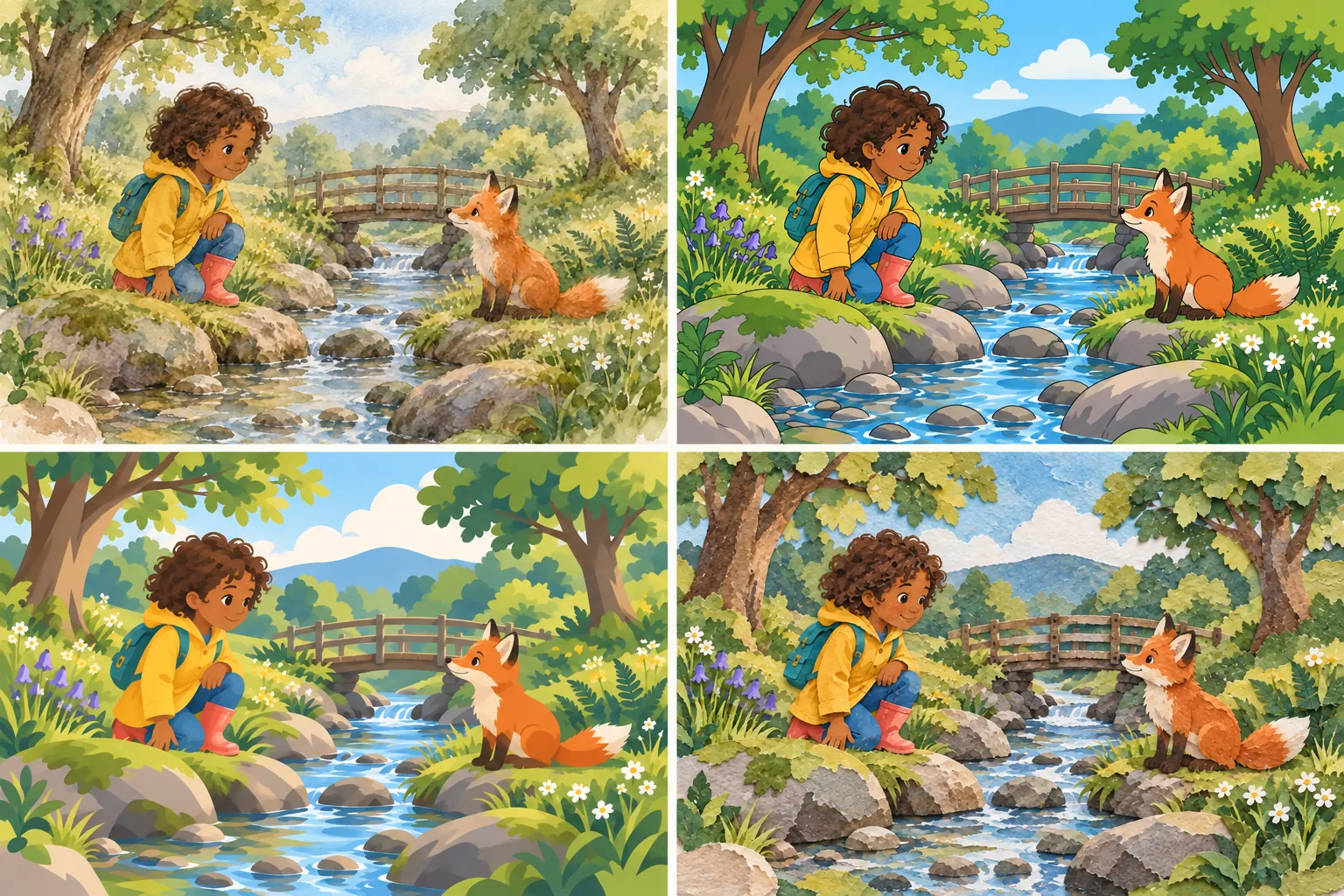
Children’s book illustration styles range from transparent watercolor and textured pencil to bold cartoons, lineless shapes, and cut-paper collage. Choose by what the story needs readers to notice: a small expression, a comic gesture, a mysterious setting, or a changing relationship.
This guide compares eight children’s book art styles using one recurring scene. You will see what changes, what to watch for, and how to test a style across several pages before committing to a whole book.
Samples of Illustration Types for Kids’ Books
These book illustration examples share a brief: a child with dark curls, a mustard-yellow raincoat, a teal backpack, and coral boots meets an orange fox beside a stream. Holding the subject steady makes children’s book illustration styles easier to compare than a collection of unrelated pictures.
About the images: these are AI-generated editorial examples made for this guide, not verified outputs from the linked product. Small differences remain between versions. Compare their treatment of shape, color, and texture rather than expecting identical anatomy or positioning.
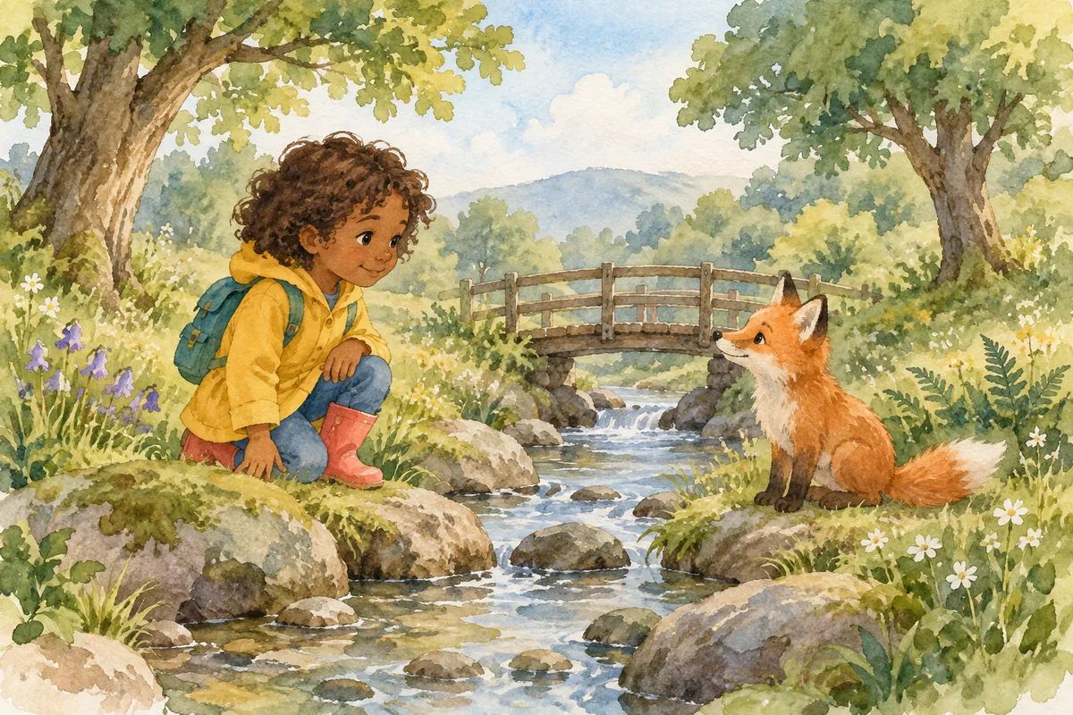
Classic watercolor
Transparent washes let the paper show through, with uneven pigment and a few crisp accents. The child and fox can feel grounded in a spacious landscape without every leaf being described. In this direction, the shape of the yellow coat carries more information than tiny folds or surface detail.
- Try it for
- Quiet encounters, changing seasons, and reflective passages with open, lightly described backgrounds.
- Watch for
- Separate pale faces and clothing from the background, especially at reading size.
Transparent watercolor washes, visible paper grain, selective sharp edges, generous unpainted space, restrained forest colors.
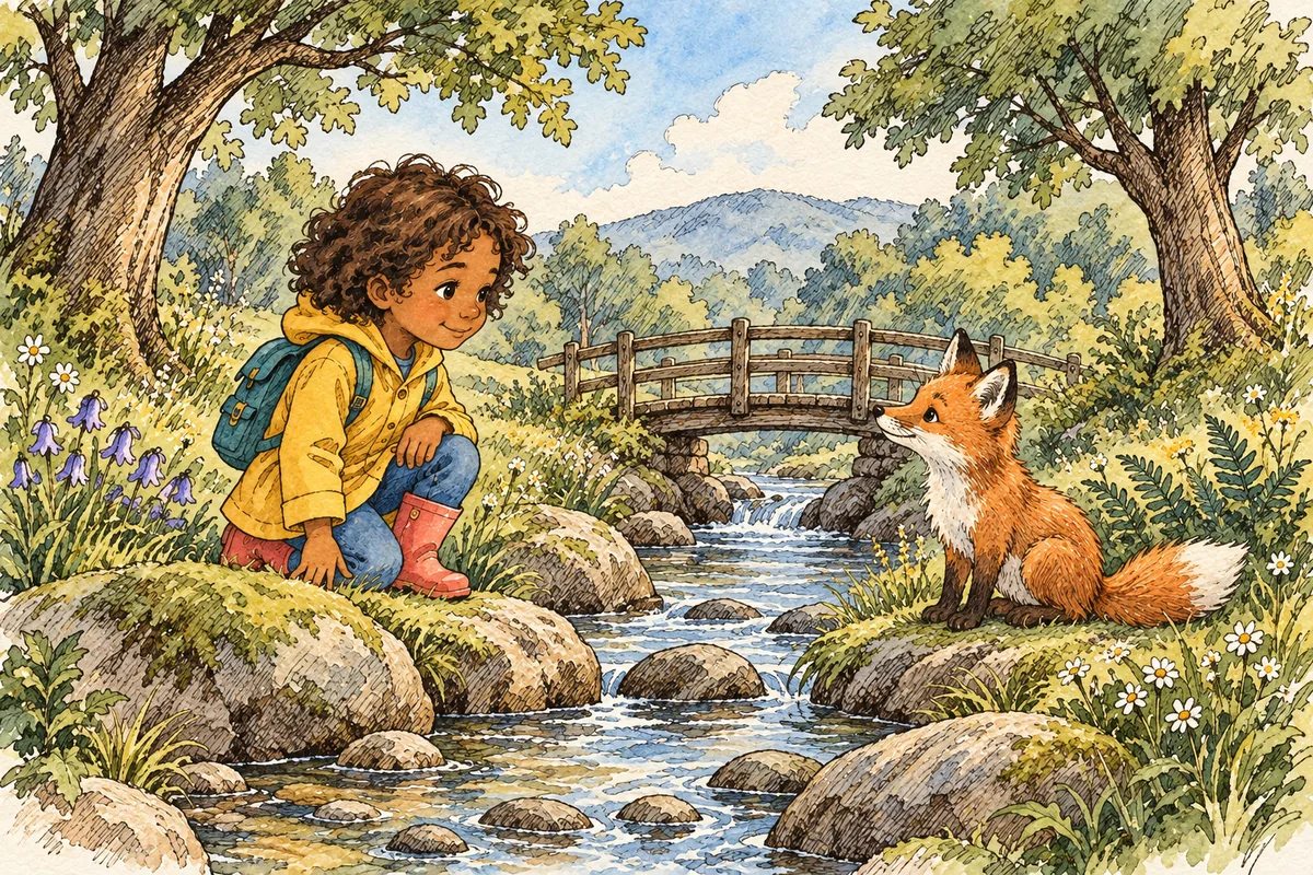
Ink and wash
A drawn line establishes the figures while loose color fills the scene. It can describe a raised eyebrow, a coat seam, or the fox’s pointed ears without painting each form fully. Letting some washes cross the ink gives the illustration movement, provided the key silhouettes still read clearly.
- Try it for
- Character-led adventures with expressive gestures, small discoveries, and lightly sketched settings.
- Watch for
- Keep contour weight stable so later scenes belong to the same book.
Fine expressive ink contours, loose transparent color washes, occasional broken lines, lightly sketched woodland setting.
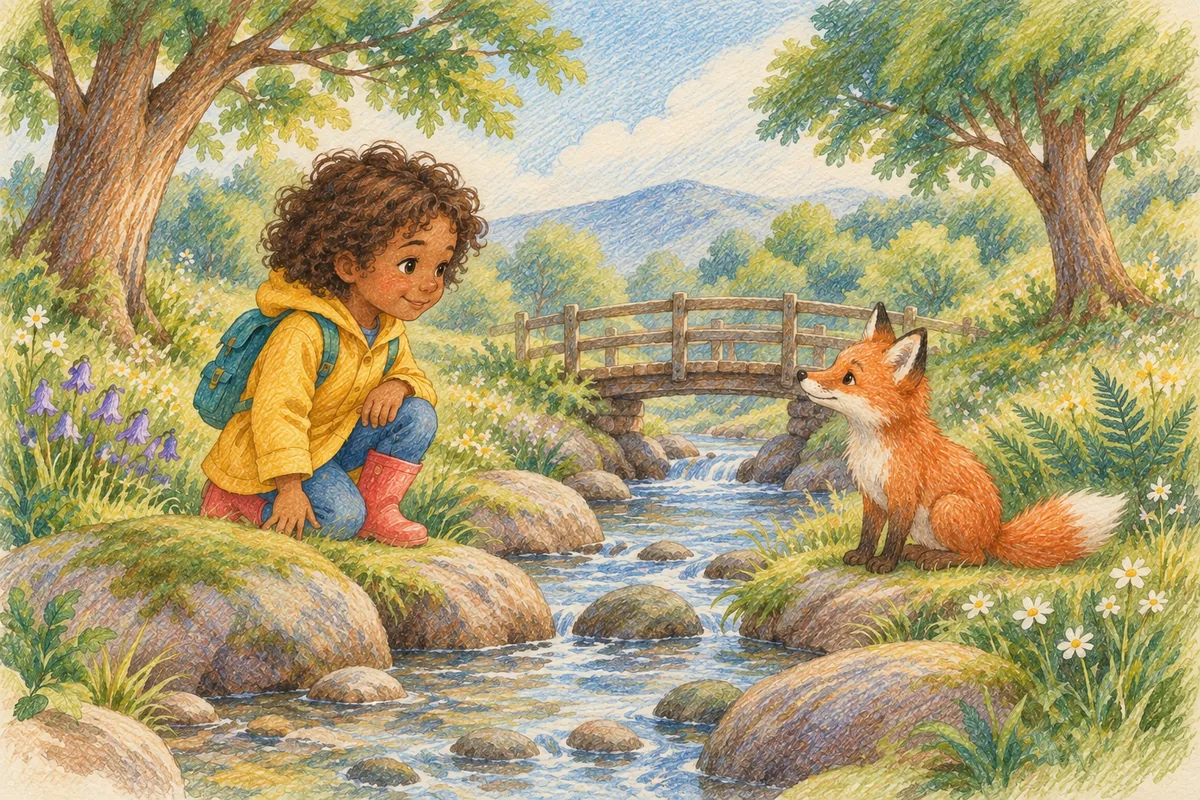
Colored pencil
Layered strokes and visible grain create a drawn surface rather than a smooth painted finish. Directional marks can distinguish curls, grass, and fur using the same small palette. This gives you a useful way to vary texture while leaving the characters’ shapes simple enough to repeat in later scenes.
- Try it for
- Everyday discoveries and nature stories that invite close attention to small details.
- Watch for
- Reserve dense texture for useful details; keep faces and text areas clear.
Layered colored-pencil strokes, visible grain, warm limited palette, directional hatching, simple expressive faces.
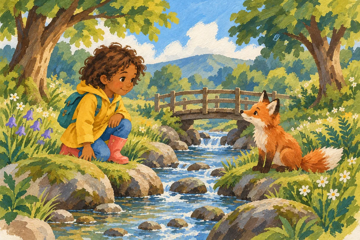
Gouache
Opaque areas of color give the coat, trees, and stream a solid presence. Brush marks can remain visible within those shapes, so the scene need not look mechanically flat. For stylized children’s book painting, rounded foliage and deliberately simplified forms can be as important as the simulated paint texture.
- Try it for
- Colorful journeys with broad shapes, rounded scenery, and a visibly painted surface.
- Watch for
- Balance background brushwork against the character, so the important action remains visible.
Opaque matte gouache, broad painted shapes, visible brush texture, rounded trees, confident limited color palette.
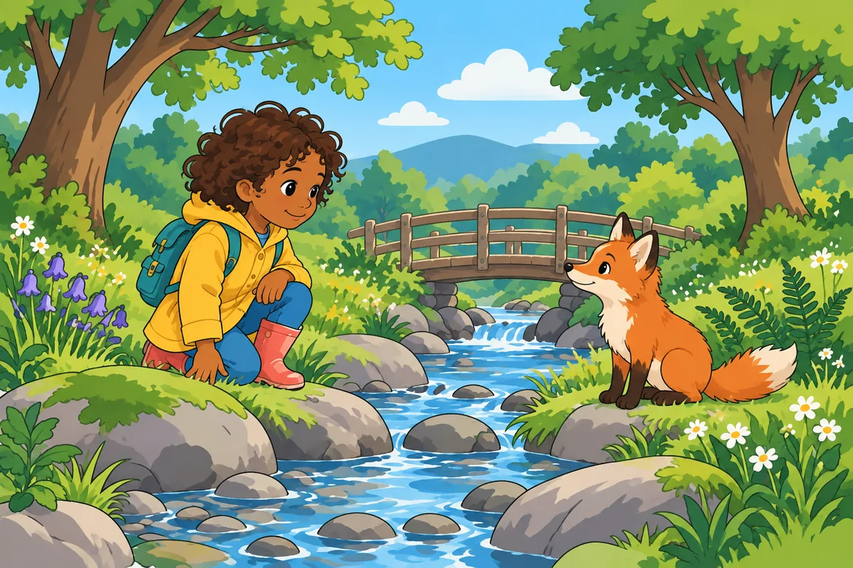
Flat cartoon
Solid fills and simplified shapes make the pose easy to inspect. A compact face and a few deliberate contours can carry the expression without elaborate shading. These simple children’s book illustrations work through staging: the distance between the child and fox becomes part of the story, not merely empty space.
- Try it for
- Visual jokes and repeated actions that need clear, immediately distinguishable poses.
- Watch for
- Check head size, clothing shapes, and accessories; simplified construction exposes proportion changes.
Flat cartoon shapes, solid colors, sparse clean contours, minimal shading, expressive pose, uncluttered background.
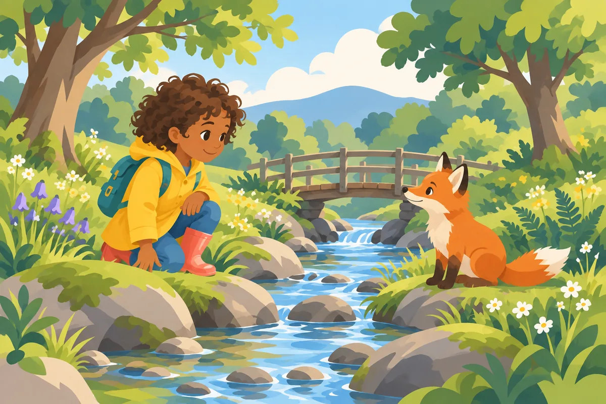
Lineless digital
Colored shapes meet without a dark contour wrapping around them. Edges, overlap, and differences in lightness define the figures instead. The method can look crisp rather than soft: a sharply cut yellow sleeve against a darker tree is still lineless, even though both shapes have very definite boundaries.
- Try it for
- Graphic scenes where distinct silhouettes carry the relationship between characters.
- Watch for
- Separate touching colors and overlapping limbs through value, placement, or background changes.
Lineless digital shapes, no dark outer contours, clear value separation, crisp silhouettes, minimal internal shading.
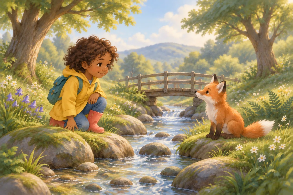
Soft digital painting
Blended transitions and selective soft edges create atmosphere around the main action. You can keep the child’s face sharper while allowing distant trees to recede. A soft finish is therefore an edge-and-light choice, not a requirement to blur the whole picture or make every color pale and desaturated.
- Try it for
- Intimate conversations, misty settings, and quiet pauses shaped by the surrounding light.
- Watch for
- Preserve clear faces and hands instead of blending every edge equally.
Soft digital brushwork, gently blended light, selective soft edges, clear faces, quiet woodland atmosphere.
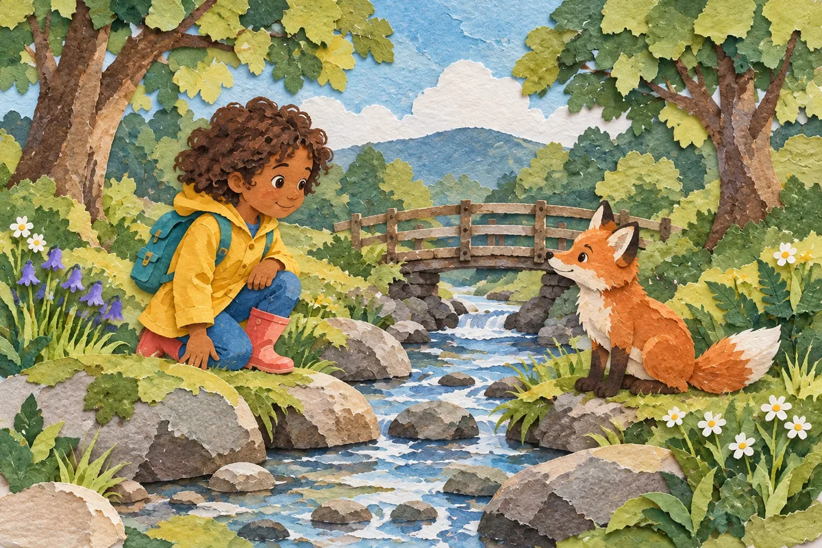
Paper collage
Cut shapes, layered edges, and contrasting paper textures build the scene piece by piece. The child’s coat can remain one broad yellow shape while patterned foliage supplies variety. Collage can be made physically or simulated digitally; the visible layering is what distinguishes this example from an ordinary flat fill.
- Try it for
- Playful journeys and object-based stories with a repeated vocabulary of textures.
- Watch for
- Keep paper texture scale and cut-edge treatment consistent as the pose changes.
Layered cut-paper shapes, visible paper fibers, restrained patterns, shallow overlap shadows, bold character silhouette.
Children’s Book Illustration Styles Compared
Use this table to shortlist two directions. These are practical comparisons, not fixed rules about genres or age groups; children’s book illustration styles overlap, and each can be adapted to different stories.
| Style | Try it for | Watch for |
|---|---|---|
| Classic watercolor | Quiet encounters, changing seasons, and reflective passages with open, lightly described backgrounds. | Separate pale faces and clothing from the background, especially at reading size. |
| Ink and wash | Character-led adventures with expressive gestures, small discoveries, and lightly sketched settings. | Keep contour weight stable so later scenes belong to the same book. |
| Colored pencil | Everyday discoveries and nature stories that invite close attention to small details. | Reserve dense texture for useful details; keep faces and text areas clear. |
| Gouache | Colorful journeys with broad shapes, rounded scenery, and a visibly painted surface. | Balance background brushwork against the character, so the important action remains visible. |
| Flat cartoon | Visual jokes and repeated actions that need clear, immediately distinguishable poses. | Check head size, clothing shapes, and accessories; simplified construction exposes proportion changes. |
| Lineless digital | Graphic scenes where distinct silhouettes carry the relationship between characters. | Separate touching colors and overlapping limbs through value, placement, or background changes. |
| Soft digital painting | Intimate conversations, misty settings, and quiet pauses shaped by the surrounding light. | Preserve clear faces and hands instead of blending every edge equally. |
| Paper collage | Playful journeys and object-based stories with a repeated vocabulary of textures. | Keep paper texture scale and cut-edge treatment consistent as the pose changes. |
Style, Medium, Mood, and Layout: What Are You Choosing?
Book illustration types are often grouped under one label even when they answer different questions. Separate four decisions when describing your preferred book drawing art styles:
- Style: how forms are interpreted, such as exaggerated cartoon proportions or more naturalistic figures.
- Medium or surface: watercolor, pencil, paper, or a digital treatment that resembles them.
- Mood: quiet, comic, mysterious, nostalgic, or whimsical.
- Layout: a small spot illustration, a single-page scene, or a spread across two pages.
A whimsical watercolor spot illustration combines all four. Different digital illustration styles can also share the same underlying drawing. Naming these choices separately makes children’s book illustration styles more useful as a brief: “nostalgic” alone does not tell anyone how to draw the fox.
What Makes Classic Watercolor Storybook Art Feel Classic?
For a classic watercolour storybook style, look at transparent color, the relationship between drawing and wash, and the amount of visible paper. A light wash can leave a scene open; fine ink or pencil can bring attention back to a face or an object.
Vintage children’s book illustrations are useful references for composition and mark-making, but “vintage” is not one recipe. When looking at famous children’s book illustrations, identify the choices you admire rather than asking to reproduce an illustrator’s signature. Is it the reserved background, the changing line, or the scale of the character on the page?
Among children’s book illustration styles, watercolor is a starting direction rather than a promise of gentleness. Strong darks, crowded framing, and sharp gestures can change its mood considerably.
What Is Soft Illustration, and Is Lineless Art the Same?
“Soft illustrated” is an imprecise description. Make it actionable by naming soft edges, blended light, fine texture, or a restrained palette. Keep the eyes, hands, and essential action sufficiently defined. Softness does not require weak contrast everywhere.
Lineless art describes the absence of enclosing outlines. It may use crisp shapes, blurred edges, or both. When comparing children’s book illustration styles, ask two separate questions: how are the boundaries drawn, and where does the picture direct attention?
Can lineless art suit children aged 8–10?
It can, but the outline alone does not decide suitability. Check whether overlapping figures separate, expressions survive at reading size, and the action is understandable. A reader’s interests and the story’s complexity also matter. The sources reviewed for this guide do not establish a universal benefit for this age range.
How to Choose Children’s Book Illustration Styles for Your Story
What are some good art styles for storybooks? Begin with one important scene and two possible treatments. For a joke, compare the clarity of the poses. For a hesitant first meeting, compare how well each version communicates distance and expression. Judge the story beat before choosing the prettiest texture.
Simple children’s book illustration styles can leave room for text and reduce competing detail. A richly textured approach can reward closer looking. Neither choice removes the need to check composition at the size readers will actually see.
Think about the reading context, too. A concept book may repeat isolated objects; a narrative picture book needs visual continuity; an illustrated chapter book may combine text with occasional smaller drawings. These are book formats, not required art styles.
For a student book picture style, give particular attention to the task on the page. A diagram that identifies an object needs different detail from a story scene that invites discussion. Try one page with its real text or labels before extending the treatment.
The best children’s book illustration styles for your project should survive that practical test and still feel connected to your writing.
Keep Characters Recognizable Across Pages
A style choice becomes useful when it can sustain a cast. Make a short reference sheet with the character’s proportions, hair shape, clothing colors, and distinctive accessories. Record the visual treatment separately so identity does not become confused with texture.
Test three scenes: a quiet close view, an active full-body pose, and a wide setting. These expose different weaknesses in children’s book illustration styles: a textured face may become unclear at a distance, while a simplified figure may need a stronger gesture to convey emotion.
Use the character consistency guide to plan your reference, and the reusable character prompts to separate fixed identity details from changing scene instructions. Review each new image; a reference helps guide a result but does not guarantee an exact match.
Copy a Prompt and Check Your First Sample
When drawing children’s book illustrations or briefing an image tool, start with one scene and one finish. This prompt lets you compare children’s book illustration styles by changing the style line while keeping the subject description stable.
Character: a child with short curly dark-brown hair and warm brown skin, wearing a mustard-yellow raincoat, a teal backpack, and coral-red boots.
Scene: the child crouches beside a stream, looking at a small orange fox. Rounded trees and a small wooden bridge sit behind them.
Style: [paste one style direction from the examples above].
Keep the character features, clothing colors, action, and viewpoint stable. Leave a quiet area for story text added later. Do not include lettering.
To learn how to draw in a children’s book style, use the examples as observation exercises: simplify the silhouette, choose where edges stay sharp, and limit texture to useful areas. The prompt describes those choices; it does not replace drawing practice or editorial review.
Check each sample beside the reference:
- Identity: hair, proportions, clothing, and accessories still identify the same character.
- Action: the pose, gaze, and relationship between figures communicate the intended moment.
- Separation: faces and limbs remain distinct from surrounding shapes.
- Page space: the real text fits without covering an important gesture or expression.
- Continuity: line weight, palette, texture, and background detail match the other samples.
For software, distinguish making the illustration from laying out the finished book. You may need both an image-making workflow and a separate layout editor for text and page design.
For an AI-assisted starting point, explore the children’s book illustration generator, then open the story workspace. Generate one sample, inspect it, and refine the brief before extending it. Generation requires sign-in and credits; the guide and prompts are free to read and copy. Check final dimensions and your publisher’s requirements before preparing a book for print.
Sources and Further Reading
The categories were informed by Reedsy’s illustrated style survey, Kindlepreneur’s styles and media guide, and Get Your Book Illustrations’ distinction between style, medium, and format. Our comparisons and sample-checking suggestions are editorial guidance, not findings about child development. There is no single “most beautifully illustrated” children’s book: use reference reading to develop a brief, not a universal ranking.
Frequently Asked Questions
What is the best illustration style for children's books?
The best children’s book illustration styles are the ones that suit your story and remain clear throughout it. Compare a quiet scene, an action scene, and a wide view before choosing. No medium or finish is the best choice for every reader.
What does “soft illustration” mean?
Here it describes gentle transitions in edges, light, or texture. It is a useful visual description rather than a fixed art category. A soft picture can still contain dark accents, detailed faces, and clearly separated shapes.
Can lineless art work for readers aged 8–10?
Yes, when its shapes, expressions, and action are clear. There is no evidence in the sources reviewed here that removing outlines is universally better for this age group. Test the actual pages with intended readers instead of treating age as a style rule.
How is classic watercolor different from flat digital art?
A classic watercolor look uses translucent, uneven washes and visible paper. Flat digital art usually emphasizes solid shapes and controlled edges. Digital tools can also imitate watercolor, so distinguish the visible finish from the way it was made.
Can I mix styles while keeping a character recognizable?
You can, especially for a dream or a story within a story. Keep the character’s proportions, signature clothing, and distinguishing features stable. Establish a clear reason for the change and check that readers still recognize the character.
What is whimsical illustration style?
Whimsical describes playful invention, such as improbable proportions or a tree with a tiny door. It can appear in watercolor, collage, or digital art. Use it to describe the scene’s imaginative character, then specify its material and shape language separately.
Are the examples and prompts free to read and copy?
This guide and its visual examples are free to view, and you can copy and adapt the written prompts without signing in. Generating images in the linked workspace requires an account and credits. These AI-generated examples are editorial illustrations, not product test results.